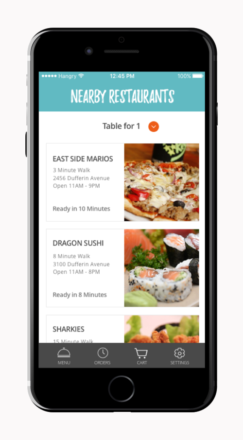
Hangry is a mobile app that lets you find nearby restaurants, book a table, and order ahead of time.

Design Challenge
We all know someone who’s been hangry. They can be irritable when they need to eat. In those moments, you try to find a restaurant but know that by the time you arrive, there’s at least a twenty-minute wait between you and a meal. Most of us resort to fast food or even a granola bar to satiate our hunger. But is there a way to enjoy the restaurant experience without the wait?
To solve being hangry, I set out to find a way to expedite the dining experience.
User Interviews
I wanted to learn if there was a need for an app to solve the problem of being hangry and how people solved the problem themselves. I started by interviewing friends and family, including young adults, parents and restaurant owners. Most had disposable income and would frequently dine out during their free time.
Initial interviews and affinity mapping told me people settled for fast food, a granola bar, or suffering.

Urban Professional
Amongst young working professionals (ages 20-30) I found that people would bring along granola bars to satiate their hunger or even suffer through the wait time at a restaurant.

I needed user research that wasn’t based on proto-personas, so I talked with real people.
Restaurant Owners and Chefs
I spoke with a restaurant owner who told me that food delivery apps want a 30% cut of his margins.
This meant I would have to pass the cost to the user in order to get restaurants on board. I did further research to ensure a convenience fee wouldn’t deter the user.
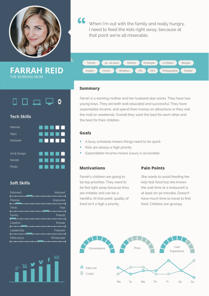
Working Mother
Working parents validated the need to get food quickly. Kids can be a handful when they’re hangry and I learned that parents would like to avoid fast food restaurants as much as possible. I knew that if I could find a way to expedite the dining experience for parents, I would meet their needs.
I didn’t consider children being hangry until I spoke with Farrah.
Competitive Research
I took a look at the competitive landscape and found many players who are simplifying the food and beverage industry.
These apps provide a good service but live in silos. None of the apps work together to let the user book a table and order food, all at once.

Market Opportunity
From my research and findings, I put together a comprehensive business model canvas that aligned the value proposition to the user’s needs.

Strategy
I decided to build a mobile app that allows someone to find nearby restaurants, book a table and order food ahead of time. I leveraged an iterative process to get feedback early in my userflow diagrams, sketches and wireframes before moving to high-fidelity design and prototypes. After each development phase, I conducted user testing to obtain feedback for implementation in the next phase.
User Flows
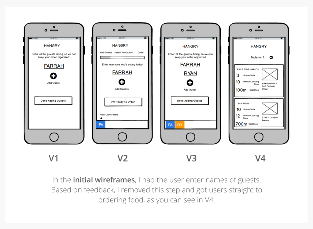
I went through several iterations of my user flows. Initially, I asked the user to enter names to individualize orders and make the experience easier for servers, but I learned from feedback that when people are hangry, they just want to order food.
I decided to remove unnecessary steps and simplify the user journey.

Initial Sketches
My initial sketches look much closer to my final prototype, even though my user flows and wireframes went through several iterations.
I learned a valuable lesson that I had an optimal design at the beginning of my process.

I got some initial feedback on my sketches:
- What if I don’t want to use a current location?
- What if the app can’t find a restaurant?
- Can you share payments with guests?
This feedback was good but not consistent with the needs of my primary persona.
I noted suggestions for future iterations for the product roadmap.
Wireframes
Next, I began working on wireframes, which evolved into multiple iterations.
I asked the user to enter names to individualize orders and make the experience easier for servers.
I learned from feedback that when people are hangry, they just want to order food. I therefore revised my wireframes.
Style Tile & Branding
Before working on a high-fidelity design, I focused on establishing a look and feel for the app.
Colour
When people are irritable I thought it made sense to present a cool and calm colour palette in the form of shades of blue. I also incorporated some strong reds/oranges to remind the user that it’s a food app. In the first iteration the brand felt too corporate, so I lightened it up with some aqua blues.
Typography
I chose fonts like Montserrat and Open Sans to ensure legibility throughout the app, especially in the food menu areas. Again, the first version felt too stiff, so I found a fun font called Playlist that completely lightened up the experience.
Personality
To create a sense of fun and pleasure I used a monster mascot in my branding, the app icon, and during on-boarding.
I included monster ears in the logo so that users, like parents, enjoy the experience.
Resulting Style Tile

High Fidelity
I went through two major iterations during the high-fidelity phase. My first version incorporated the progress bar I was using to split orders. It also had a very stiff and corporate look and feel. After receiving user feedback, I found a fun font that changed the feel of the app completely. The final version started to look clean, simple and exciting.

Prototype
The final steps of the project included developing a fully functional interactive prototype in Invision. I used this version for additional usability and user testing.
Watch the video to see how the app reserves a table and places an order, or try the demo yourself.
Results
Hangry is an app designed to save time. Time is the only thing between someone who is hangry and their food. I put together a chart below that’s based on qualitative assumptions and illustrates how much time an app like Hangry can save.

Key Learnings
Personas have the answers
My idea for Hangry started strong, but it became concrete only after speaking with a working mother and a restaurant owner, who both validated the idea and expanded the market
Simple is better
I lost track of the urgency of the need to dine quickly in my initial steps of the app. After user testing I realized that simple is better, and I streamlined the entire user flow.
Delightful is just a font away
The final look of the app looked entirely different by simply changing a colour and a font, which was a huge relief.
Empathy is more than just listening
One of my biggest lessons during this project was gaining a new perspective on empathy. Originally, I thought empathy meant listening to the user while they provided feedback. What I learned is that a designer has to separate their preconceived notions of what the final solution might look like. This requires both listening to the user and checking your own ego. Once I did that, I noticed that the versions of my design improved significantly.
